Admin Columns UI improvements
As the launch of Admin Columns 4 draws ever closer, we’re happy to discuss some of the improvements that have been going on over the past year. In today’s edition: the UI improvements that will make column management with Admin Columns easier than it ever was before.
Let’s start by reassuring you: we’re not doing a complete overhaul of Admin Columns’ settings screen. When we first started talking about the release of Admin Columns 4 some year and a half ago, we quickly reached the conclusion that our interface was already highly appreciated by Admin Columns users. It’s easy to use, and users are familiar with its style and interactions from the rest of the WordPress admin panel. However, some aspects of the UI have been nagging both our users and ourselves. This was reflected in the feedback we received (for which we thank you!).
The Columns Settings Screen
For one, the interface had started to fall out of line with the WordPress interface. Or, rather, the WordPress interface had changed gradually and the Admin Columns interface hadn’t. Admin Columns 4 is here to change that. To our long-time users, the changes to the UI might seem minor, but to our newer users, they can make a significant difference: the Admin Columns 4 interface is in line with the WordPress interface again and allows our new users to get started more easily.
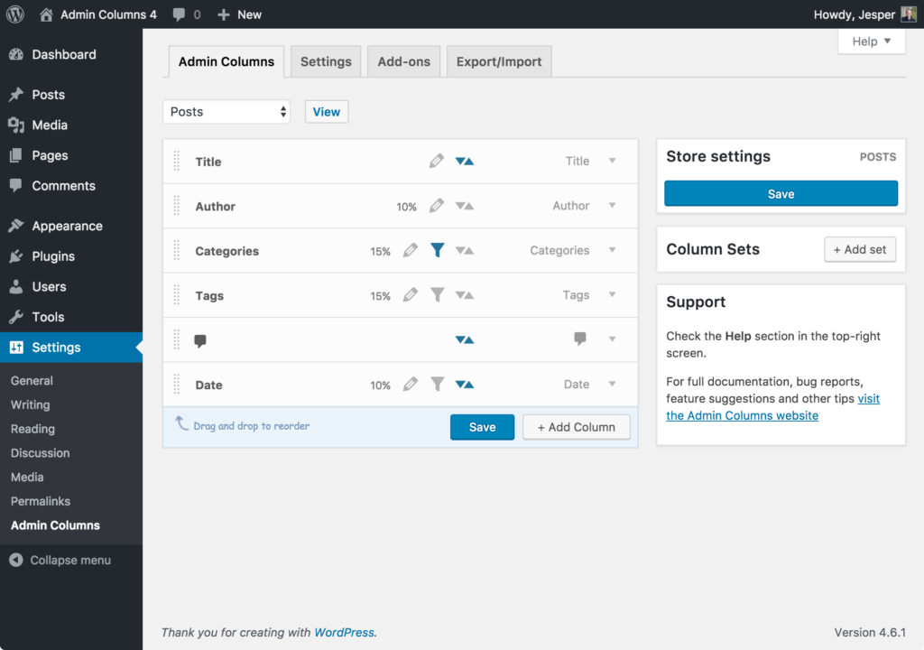
The Admin Columns 4 interface aligns perfectly with the WordPress admin look and feel
Increasing the margins of the most content-heavy part of the settings screen – the columns overview – and removing some gradients from the individual column settings allows our users to observe the current column setup in a glance, and to easily find their way through adding, updating and removing columns from their content overview pages.
Organising the settings boxes for individual columns
Admin Columns currently features more than 150 columns, including columns for Advanced Custom Fields, WooCommerce and bbPress. And, as you can imagine, many columns have settings you can tune to customize the admin panel to your liking. With all of these new columns and column settings that have been added through the years, the management of columns as it was in Admin Columns did not offer the intuitive experience we wanted our users to have access to. With Admin Columns 4, we’ve made sure that your column management is future-proof as ever.
Perhaps, the biggest interface change in Admin Columns 4, individual column settings are now grouped together where relevant, and existing UI elements have been improved to reduce clutter and improve usability. Let’s not dwell on this for too long using text: take a look at the screenshots below. (Or, better yet: join our group of beta testers and get some hands-on experience with Admin Columns 4 straight away! Our current users can simply head to the beta page and leave feedback on the beta feedback forums).
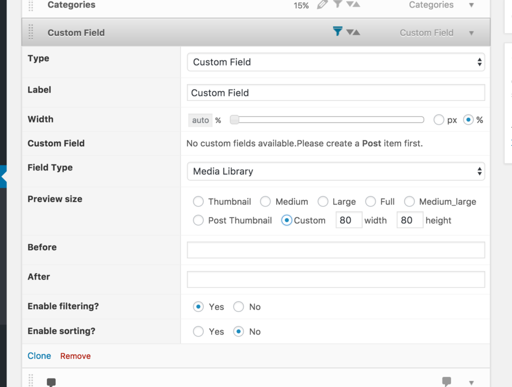
The old interface for the Media Library custom field column
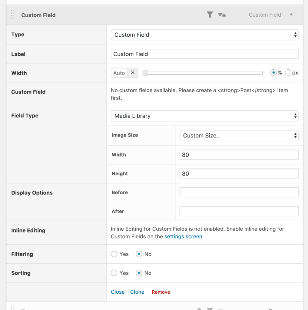
And the corresponding new interface in Admin Columns 4
Grouping buttons
As research has shown, most internet users read or scan a page sequentially from top to bottom and from left to right (roughly). Correspondingly, when it comes to filling out a form, they expect to be able to start at the top of the form and submit it after completing it. This is exactly why we’ve decided to make the process of setting up your columns and saving them more intuitive. Admin Columns 4 groups the relevant action buttons for changing your columns directly below your column list. The result of this can be seen in the images below, where both the form setup from Admin Columns 3 and the setup from Admin Columns 4 are displayed side-by-side.
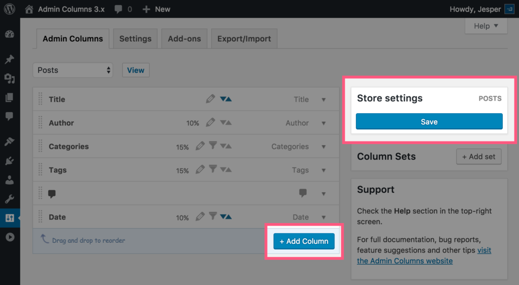
The “Save” button for Admin Columns 3 is located in the top right corner of the settings screen…
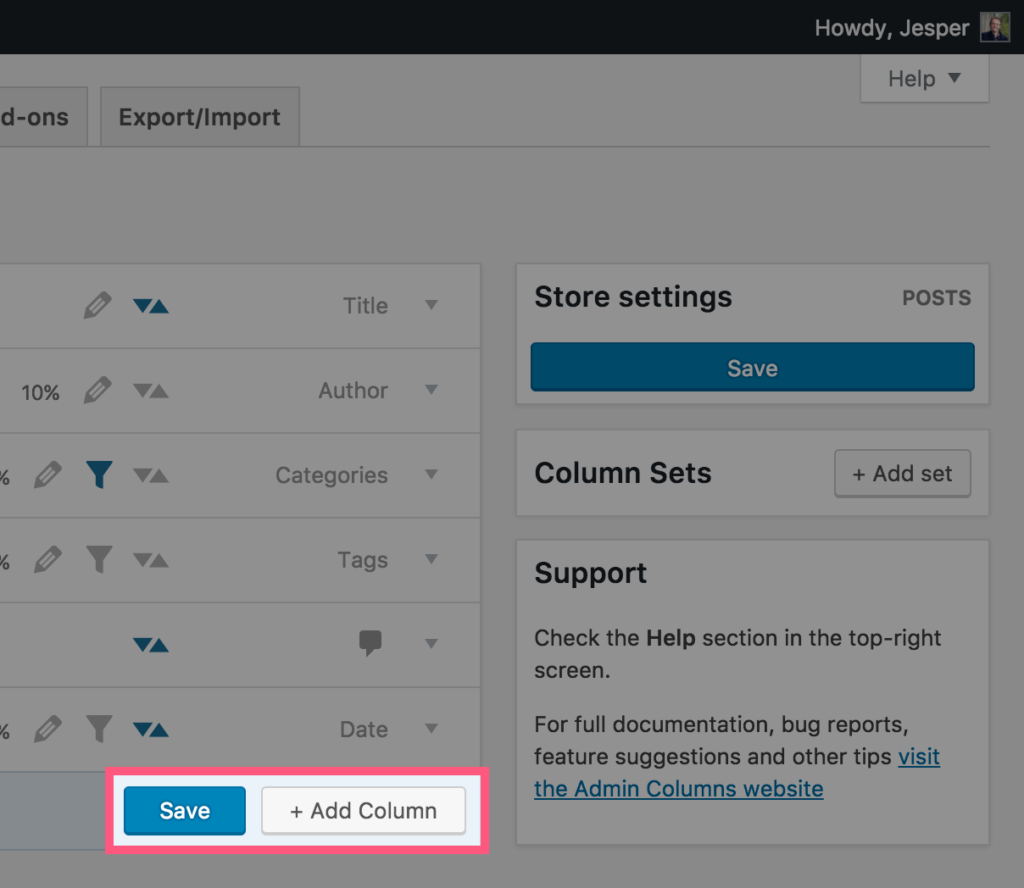
…whereas the Admin Columns 4 Columns buttons are nicely grouped together.
Combined, these changes improve Admin Columns’ ability to enhance your admin screens for posts, users, comments and other types of content even further. We can’t wait for release day. Can you?