Thanks for your feedback.
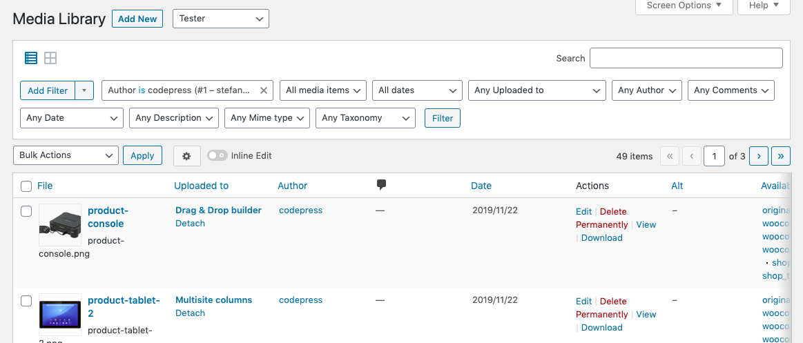
I agree that the media overview needs some attention. The default filters should be combined with our smart filters. But we most likely keep the complete second row for our filter logic. We prefer our Smart Filteirng feature over our ‘old’ filtering feature. The great difference is that the smart filters will only be visible once you add them manually on the overview. The old filters are always on the overview page, which can make the overview overwhelming, but this is something you can manage as an admin. This is an example of how it should look and how we will implement it in the next release.

To be honest, we’re completely happy with the UI on the post overview at this moment. Unless you see something that we don’t see. Otherwise, it would be a matter of taste I guess.


